
How vulnerable is every neighborhood in the country to emergencies?
If you've followed the Censtats blog at all (which, of course you have) then you know we love to talk about tools; not your hammers and your wrenches, but your digital maps and software instead. In the past we've covered the Housing Permit Tool and the My Community Explorer, and as this preamble might be foreshadowing... We have another to share!
This time around, our eyes fall on the Community Resilience Estimates. This is like a sibling to the aforementioned My Community Explorer - whereas My Community Explorer showcased what the response for emergencies different communities had, especially in real time, Community Resilience Estimates indicate how at-risk those communities actually are to begin with. This emerged in the summer of 2020 when COVID was around its peak and where analyzing the vulnerability of the different parts of the United States was necessary for adequate response. This then branched out beyond just COVID and includes data for other emergencies as well.
“
Naturally, all of the data gathered through this program can be explored through data sets here. But this data is also visually explorable here.
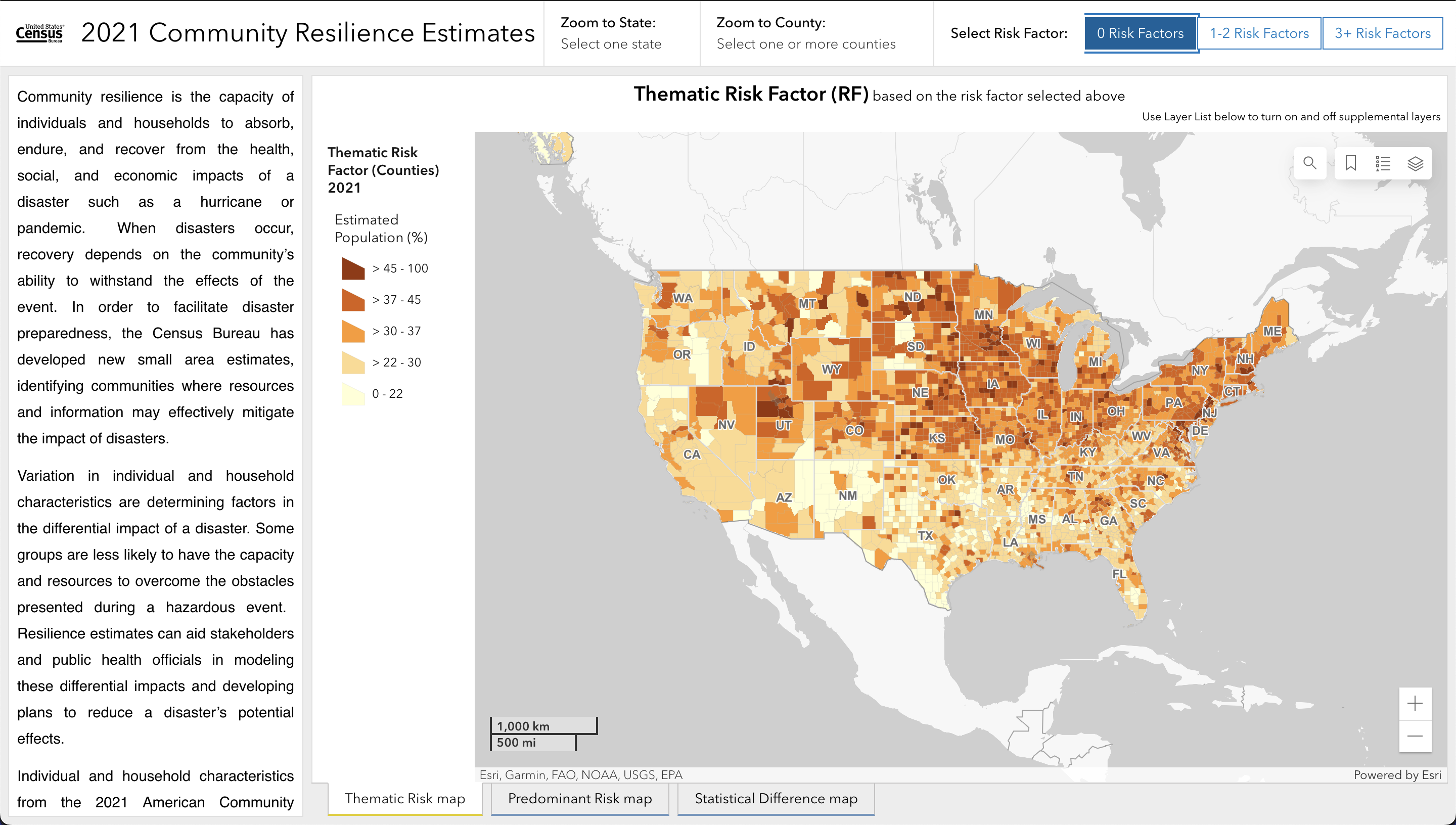
The important question to ask before even diving further into this sort of data is, "What constitutes a risk factor?" The American Community Survey, from which this data is collected, frames a risk factor as being any of these:
So when analyzing the visual map, you can break it down further into state and county:
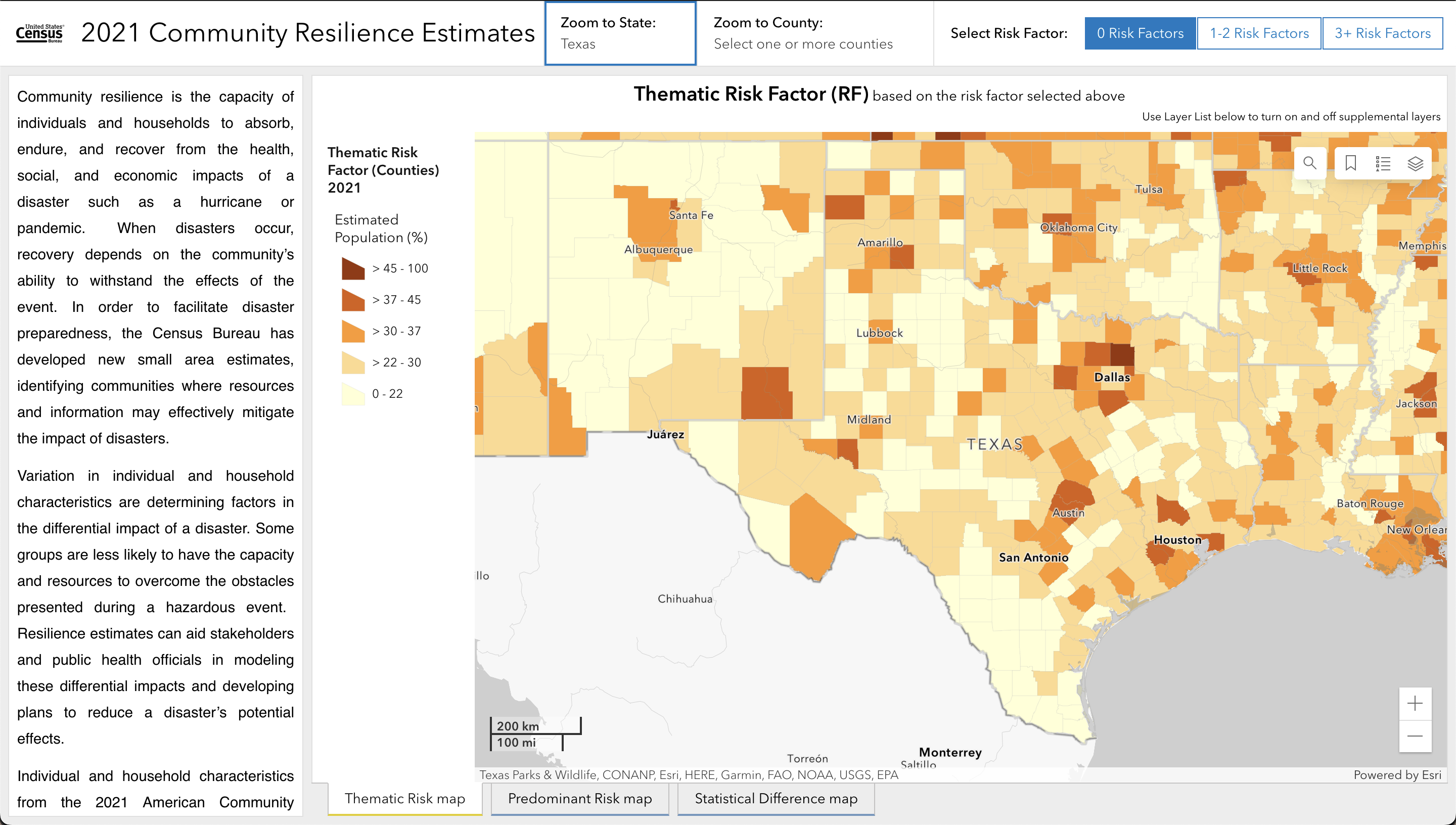
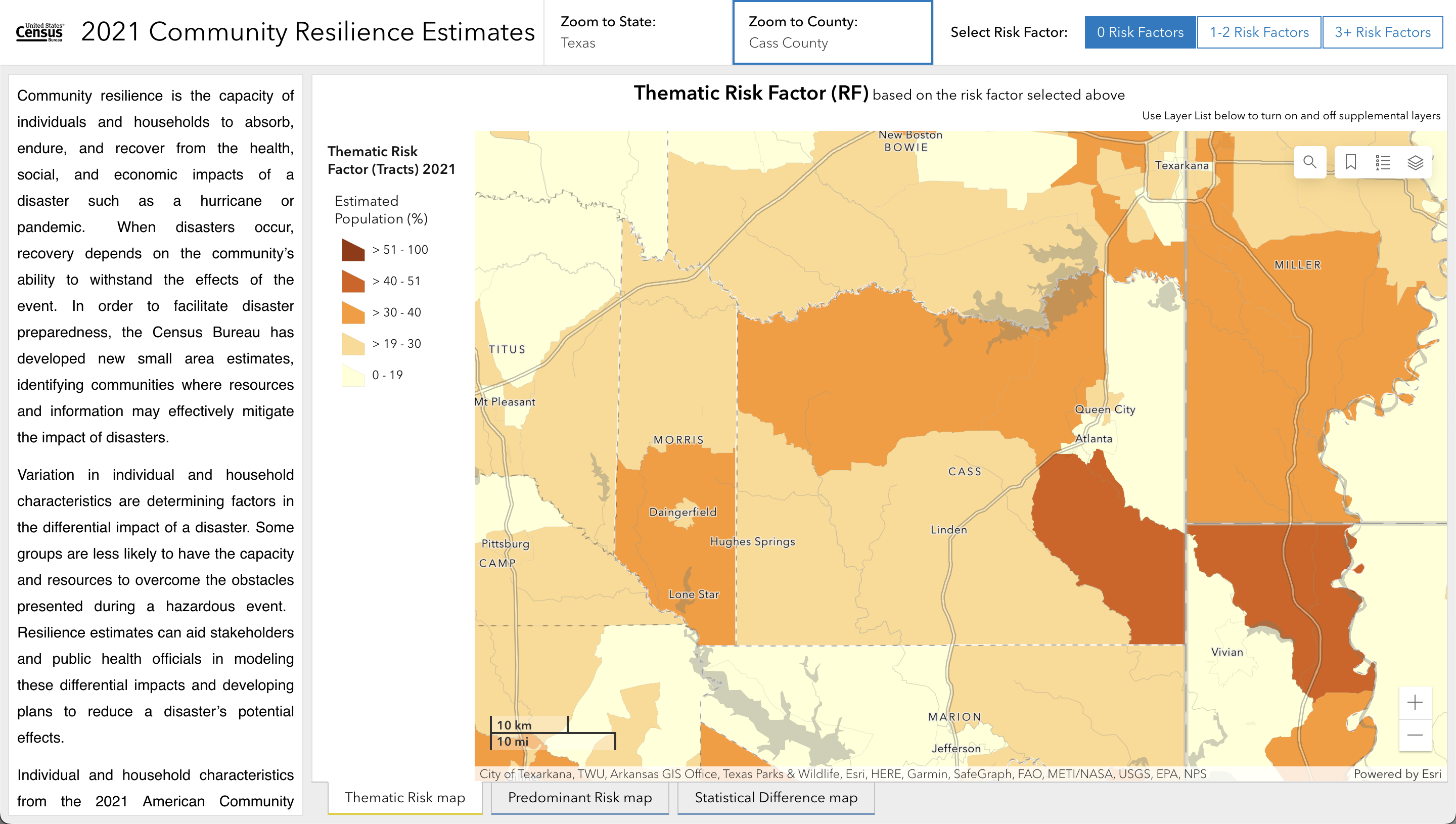
Then taking the above listed risk factors, you can map each state/county by how many they feature (1-2 and 3+):
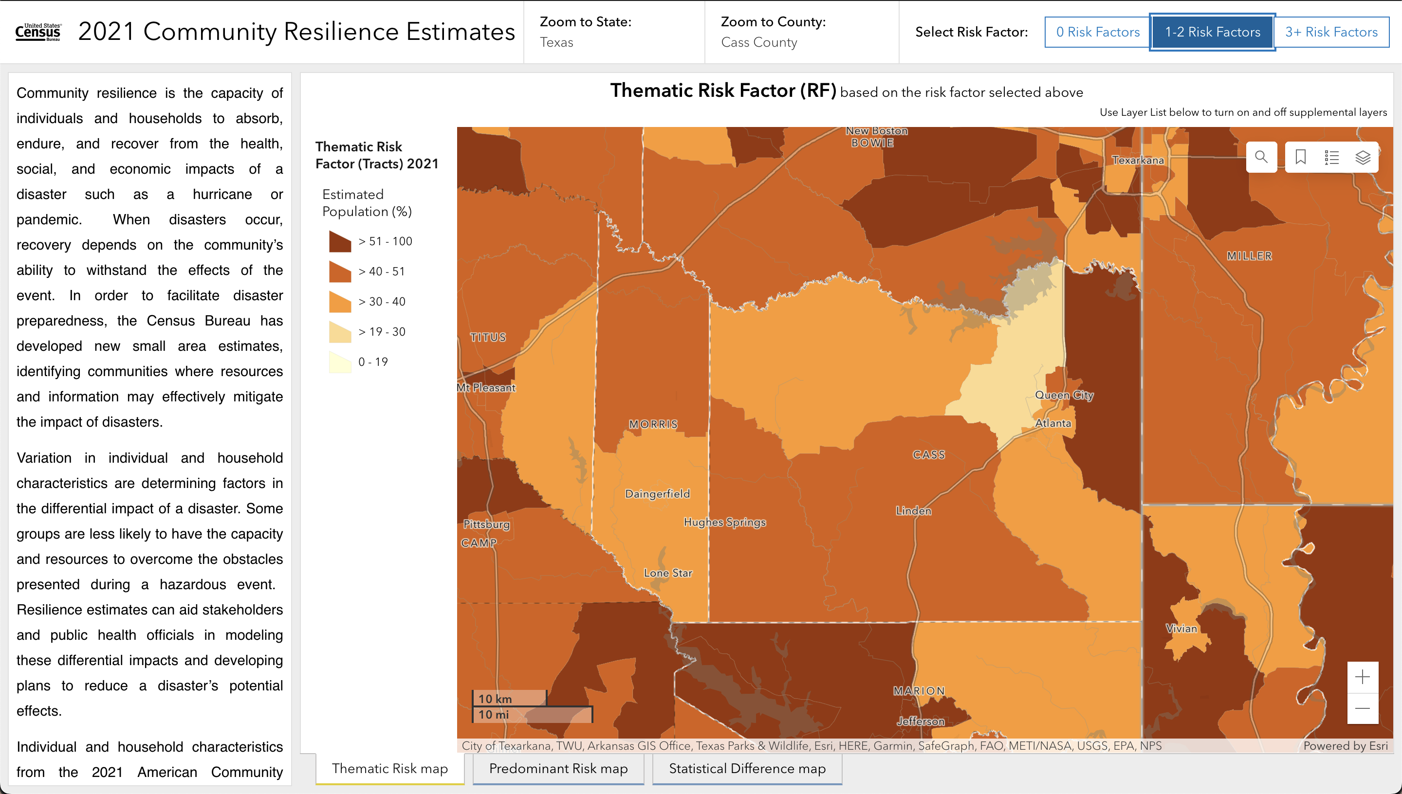
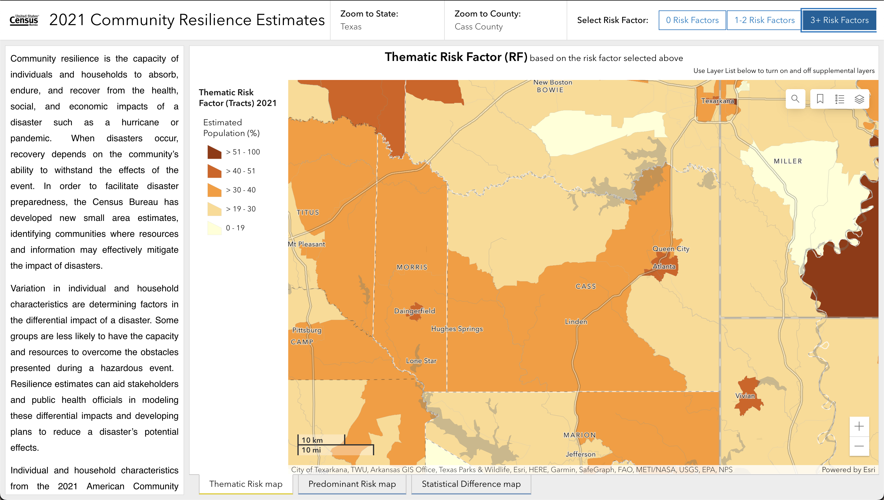
Beyond those elements, you can also choose to view Thematic Risk, Predominant Risk, or Statistical Difference in map form, but the general idea presented here is in the necessity of predicting in granular detail just what parts of the country are most likely to be affected by... anything. It's not necessarily a "specified emergency preparedness" tool, but a "If anything bad happens, how likely is it for this particular neighborhood to get back on their feet?" tool, though on occasion they do focus on one specific issue.
For example, with the predicament of devastating heat waves the Census Bureau has produced an experimental CRE to cover that specific issue (more details on that data can be read here). In addition to specific issues, there's also specific coverage for Puerto Rico, which isn't included in the traditional CRE since how the U.S. and Puerto Rico handles neighborhoods and counties differ a little bit.
Overall, it's a win for accessibility of information to have useful local information like the vulnerability of our neighborhoods available in an easy-to-understand way such as with this tool. After getting to play around with this, the Housing Permit Tool, and My Community Explorer, we can't wait to see how else the Census Bureau expands upon this level of digital communication.
For more reading, you can check out the Community Resilience Estimates Equity Supplement which helps to provide useful context for the demographics researched.
Header image sourced with permission from djvstock.
This September marks the third annual campaign to raise disaster readiness and response education
A look at the Census Bureau's newest developments on the next decennial census